%load_ext autoreload
%autoreload 2
import os
import sys
import matplotlib.colors as colors
import matplotlib.pyplot as plt
import numpy as np
import pandas as pd
import scanpy as sc
import seaborn as sns
This notebook was made with celloracle version 0.10.8. Please use celloracle>=0.10.8 Otherwise, you may get an error.
import celloracle as co
co.__version__
'0.18.0'
#plt.rcParams["font.family"] = "arial"
plt.rcParams["figure.figsize"] = [6,6]
%config InlineBackend.figure_format = 'retina'
plt.rcParams["savefig.dpi"] = 600
%matplotlib inline
0.1. Make a folder to save graph
# Make folder to save plots
save_folder = "figures"
os.makedirs(save_folder, exist_ok=True)
# Load the tutorial oracle object.
oracle = co.data.load_tutorial_oracle_object()
oracle
# Attention!! Please use the function below when you use your data.
# oracle = co.load_hdf5("ORACLE OBJECT PATH")
Data not found in the local folder. Loading data from github. Data will be saved at /data/homezvol2/ddlin/celloracle_data/tutorial_data
0%| | 0.00/77.7M [00:00<?, ?B/s]
Oracle object
Meta data
celloracle version used for instantiation: 0.10.0
n_cells: 2671
n_genes: 1999
cluster_name: louvain_annot
dimensional_reduction_name: X_draw_graph_fa
n_target_genes_in_TFdict: 21259 genes
n_regulatory_in_TFdict: 1093 genes
n_regulatory_in_both_TFdict_and_scRNA-seq: 90 genes
n_target_genes_both_TFdict_and_scRNA-seq: 1850 genes
k_for_knn_imputation: 66
Status
Gene expression matrix: Ready
BaseGRN: Ready
PCA calculation: Done
Knn imputation: Done
GRN calculation for simulation: Not finished
1.2. Load inferred GRNs
In the previous notebook, we calculated the GRNs. Now, we will use these GRNs for the perturbation simulations. First, we will import the GRNs from the Links object.
# Here, we load demo links object for the training purpose.
links = co.data.load_tutorial_links_object()
# Attention!! Please use the function below when you use your data.
# links = co.load_hdf5("YOUR LINK OBJCT PATH")
Data not found in the local folder. Loading data from github. Data will be saved at /data/homezvol2/ddlin/celloracle_data/tutorial_data
0%| | 0.00/59.6M [00:00<?, ?B/s]
2. Make predictive models for simulation
Here, we will need to fit the ridge regression models again. This process will take less time than the GRN inference in the previous notebook, because we are using the filtered GRN models.
links.filter_links()
oracle.get_cluster_specific_TFdict_from_Links(links_object=links)
oracle.fit_GRN_for_simulation(alpha=10,
use_cluster_specific_TFdict=True)
0%| | 0/24 [00:00<?, ?it/s]
3. In silico TF perturbation analysis
Next, we will simulate the TF perturbation effects on cell identity to investigate its potential functions and regulatory mechanisms. Please see the CellOracle paper for more details on scientific rationale.
In this notebook, we will simulate the knockout of the Gata1 gene in the hematopoiesis trajectory.
Previous studies have shown that Gata1 is one of the TFs that regulates cell fate decisions in myeloid progenitors. Additionally, Gata1 has been shown to affect erythroid cell differentiation.
Here, we will use CellOracle to analyze Gata1 and attempt to recapitulate the previous findings from above.
3.1. Check gene expression pattern.
# Check gene expression
goi = "Gata1"
sc.pl.draw_graph(oracle.adata, color=[goi, oracle.cluster_column_name],
layer="imputed_count", use_raw=False, cmap="viridis")

# Plot gene expression in histogram
sc.get.obs_df(oracle.adata, keys=[goi], layer="imputed_count").hist()
plt.show()

3.2. Calculate future gene expression after perturbation.
- You can use any gene expression value in the in silico perturbations, but please avoid extremely high values that are far from the natural gene expression range. The upper limit allowed is twice the maximum gene expression.
To simulate Gata1 KO, we will set Gata1 expression to 0.
# Enter perturbation conditions to simulate signal propagation after the perturbation.
oracle.simulate_shift(perturb_condition={goi: 0.0},
n_propagation=3)
After simulation, celloracle automatically evaluates whether the range of simulated values is appropriate and returns a warning if there is an atypical distribution. You can also evaluate the distribution pattern of simulated values in detail yourself. See the notebook below for more information. https://github.com/morris-lab/CellOracle/blob/master/docs/notebooks/05_simulation/misc/Check_distribution_of_simulation_value.ipynb
3.3. Calculate transition probability between cells
The steps above simulated tge global future gene expression shift after perturbation. This prediction is based on iterative calculations of signal propagation calculations within the GRN. Please look at our paper for more information.
The next step calculates the probability of cell state transitions based on the simulation data. You can use the transition probabilities between cells to predict how cells will change after a perturbation.
This transition probability will be used later.
# Get transition probability
oracle.estimate_transition_prob(n_neighbors=200,
knn_random=True,
sampled_fraction=1)
# Calculate embedding
oracle.calculate_embedding_shift(sigma_corr=0.05)
Caution: It is very important to find the optimal scale parameter.
We will need to adjust the
scaleparameter. Please seek to find the optimalscaleparameter for the data based on your data.If the vectors are not visible, you can try a smaller
scaleparameter to magnify the vector length. However, if you see large vectors in the randomized results (right panel), it means that the scale parameter is too small.
fig, ax = plt.subplots(1, 2, figsize=[13, 6])
scale = 25
# Show quiver plot
oracle.plot_quiver(scale=scale, ax=ax[0])
ax[0].set_title(f"Simulated cell identity shift vector: {goi} KO")
# Show quiver plot that was calculated with randomized graph.
oracle.plot_quiver_random(scale=scale, ax=ax[1])
ax[1].set_title(f"Randomized simulation vector")
plt.show()

4.2. Vector field graph
We will visualize the simulation results as a vector field on a digitized grid. Single cell transition vectors are grouped by grid point.
4.2.1 Find parameters for n_grid and min_mass
n_grid: Number of grid points.
min_mass: Threshold value for the cell density.
The appropriate values for these parameters depends on the data. Please find appropriate values using the helper functions below.
# n_grid = 40 is a good starting value.
n_grid = 40
oracle.calculate_p_mass(smooth=0.8, n_grid=n_grid, n_neighbors=200)
Please run oracle.suggest_mass_thresholds() to display a range of min_mass parameter values and choose a value to fit the data.
# Search for best min_mass.
oracle.suggest_mass_thresholds(n_suggestion=12)

According to the results, the optimal min_mass is around 0.011.
min_mass = 0.01
oracle.calculate_mass_filter(min_mass=min_mass, plot=True)

4.2.2 Plot vector fields
Again, we need to adjust the
scaleparameter. Please seek to find the optimalscaleparameter that provides good visualization.If you don't see any vector, you can try the smaller
scaleparameter to magnify the vector length. However, if you see large vectors in the randomized results (right panel), it means the scale parameter is too small.
fig, ax = plt.subplots(1, 2, figsize=[13, 6])
scale_simulation = 0.5
# Show quiver plot
oracle.plot_simulation_flow_on_grid(scale=scale_simulation, ax=ax[0])
ax[0].set_title(f"Simulated cell identity shift vector: {goi} KO")
# Show quiver plot that was calculated with randomized graph.
oracle.plot_simulation_flow_random_on_grid(scale=scale_simulation, ax=ax[1])
ax[1].set_title(f"Randomized simulation vector")
plt.show()

# Plot vector field with cell cluster
fig, ax = plt.subplots(figsize=[8, 8])
oracle.plot_cluster_whole(ax=ax, s=10)
oracle.plot_simulation_flow_on_grid(scale=scale_simulation, ax=ax, show_background=False)

5. [This step is optional] Compare simulation vector with development vectors
5.0. Method overview
As shown above, we can simulate how TF perturbations affect cell identity and visualize the results as a vector field map.
To interpret the results, it is necessary to take into account the direction of natural differentiation. We will compare the simulated perturbation vectors with the developmental gradient vectors. By comparing them, we can intuitively understand how TFs impact cell fate determination during development. This perspective is also important for estimating the experimental perturbation results.
Here, we will calculate the development vector field using pseudotime gradient as follows.
Transfer the pseudotime data into an n x n digitized grid.
Calculate the 2D gradient of pseudotime to get vector field.
Compare the in silico TF perturbation vector field with the development vector field by calculating inner product between these two vectors.
- Note: Other methods may be used to represent a continuous scRNA-seq trajectory flow. For example, RNA velocity analysis is a good way to estimate the direction of cell differentiation. Choose the method that best suits your data.
5.1 Prepare pseudotime data
In the analysis below, we will use pseudotime data. Pseudotime data is included in the demo data. If you are analyzing your own scRNA-seq data, please calculate pseudotime before starting this analysis.
Refer to the following link below to see an example about calculating pseudotime for scRNA-seq data. https://morris-lab.github.io/CellOracle.documentation/tutorials/pseudotime.html
5.2. Check data
# Visualize pseudotime
fig, ax = plt.subplots(figsize=[6,6])
sc.pl.embedding(adata=oracle.adata, basis=oracle.embedding_name, ax=ax, cmap="rainbow",
color=["Pseudotime"])

5.3. Make Gradient_calculator object
from celloracle.applications import Gradient_calculator
# Instantiate Gradient calculator object
gradient = Gradient_calculator(oracle_object=oracle, pseudotime_key="Pseudotime")
We need to set n_grid and min_mass for the pseudotime grid point calculation too.
n_grid: Number of grid point.
We already know approproate values for them. Please set the same values as step 4.2.1 above.
gradient.calculate_p_mass(smooth=0.8, n_grid=n_grid, n_neighbors=200)
gradient.calculate_mass_filter(min_mass=min_mass, plot=True)
5.4 Transfer pseudotime values to the grid points.
Next, we convert the pseudotime data into grid points. For this calculation we can chose one of two methods.
knn: K-Nearesr Neighbor regression. You will need to set number of neighbors. Please adjustn_knnfor best results.This will depend on the population size and density of your scRNA-seq data.
gradient.transfer_data_into_grid(args={"method": "knn", "n_knn":50})
polynomial: Polynomial regression using x-axis and y-axis of dimensional reduction space.
In general, this method will be more robust. Please use this method if knn method does not work.
n_poly is the number of degrees for the polynomial regression model. Please try to find appropriaten_poly searching for best results.
gradient.transfer_data_into_grid(args={"method": "polynomial", "n_poly":3})
gradient.transfer_data_into_grid(args={"method": "polynomial", "n_poly":3}, plot=True)

5.5. Calculate Gradient vectors
Calculate the 2D vector map to represents the pseudotime gradient. After the gradient calculation, the length of the vector will be normalized automatically.
Please adjust the scale parameter to adjust vector length visualization.
# Calculate graddient
gradient.calculate_gradient()
# Show results
scale_dev = 40
gradient.visualize_results(scale=scale_dev, s=5)

# Visualize results
fig, ax = plt.subplots(figsize=[6, 6])
gradient.plot_dev_flow_on_grid(scale=scale_dev, ax=ax)

# Save gradient object if you want.
#gradient.to_hdf5("Paul_etal.celloracle.gradient")
5.6. Calculate Inner product between two vectors
We will use the inner product calculations to quantitatively compare the 2D developmental flow and perturbation simulation vectors.
If you are not familiar with Inner product / Dot product, please see https://en.wikipedia.org/wiki/Dot_product
The inner product represents the similarity between two vectors.
Using the inner product, we compare the 2D vector field of perturbation simulation and development flow.
The inner product will be a positive value when two vectors are pointing in the same direction.
Conversely, the inner product will be a negative value when two vectors are pointing in the opposing directions.
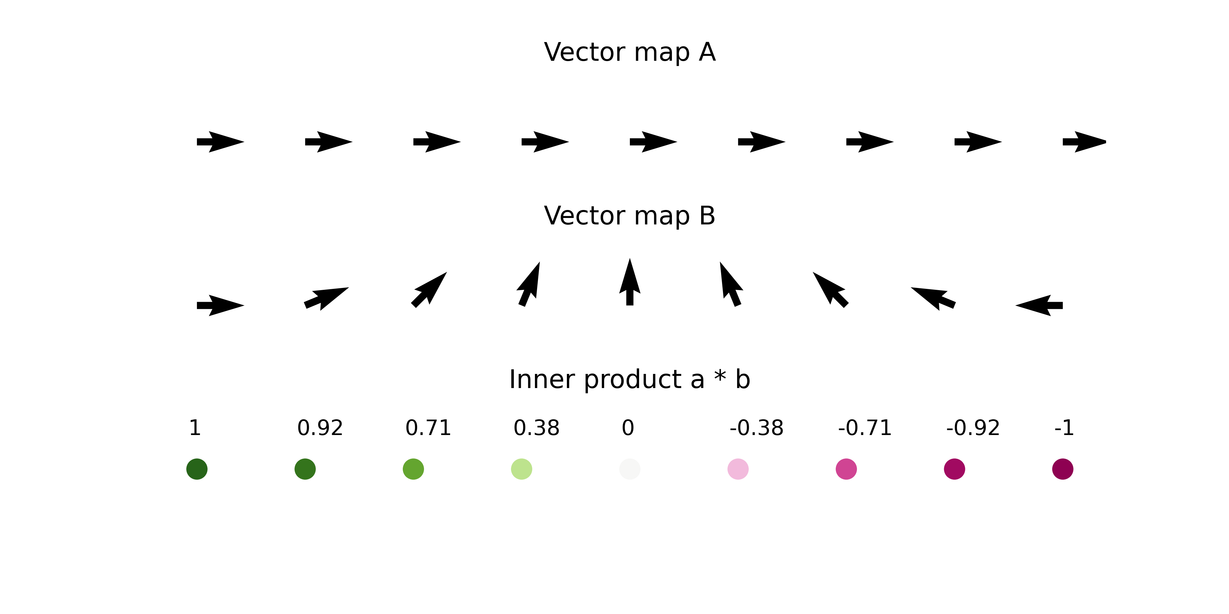
- The length of the vectors also affects the magnitude of inner product value.
In summary, we quantitatively compare the directionality and size of vectors between perturbation simulation and natural differentiation using inner product, and we define the score as perturbation score (PS).
A negative PS means that the TF perturbation would block differentiation .
A positive PS means that the TF perturbation would promote differentiation .
from celloracle.applications import Oracle_development_module
# Make Oracle_development_module to compare two vector field
dev = Oracle_development_module()
# Load development flow
dev.load_differentiation_reference_data(gradient_object=gradient)
# Load simulation result
dev.load_perturb_simulation_data(oracle_object=oracle)
# Calculate inner produc scores
dev.calculate_inner_product()
dev.calculate_digitized_ip(n_bins=10)
5.7. Show results
Here, need to adjust the
vmparameter for the PS score color visualization. Please seek to find the optimalvmparameter that provides good visualization.If you don't see any color in the left panel below, you can try the smaller
vmparameter to magnify the scale of vm visualization. However, if you see colors in the randomized results (right panel), it means the vm parameter is too small.
# Show perturbation scores
vm = 0.02
fig, ax = plt.subplots(1, 2, figsize=[12, 6])
dev.plot_inner_product_on_grid(vm=0.02, s=50, ax=ax[0])
ax[0].set_title(f"PS")
dev.plot_inner_product_random_on_grid(vm=vm, s=50, ax=ax[1])
ax[1].set_title(f"PS calculated with Randomized simulation vector")
plt.show()

# Show perturbation scores with perturbation simulation vector field
fig, ax = plt.subplots(figsize=[6, 6])
dev.plot_inner_product_on_grid(vm=vm, s=50, ax=ax)
dev.plot_simulation_flow_on_grid(scale=scale_simulation, show_background=False, ax=ax)

# Let's visualize the results
dev.visualize_development_module_layout_0(s=5,
scale_for_simulation=scale_simulation,
s_grid=50,
scale_for_pseudotime=scale_dev,
vm=vm)
2025-08-20 07:07:35,940 - INFO - Using categorical units to plot a list of strings that are all parsable as floats or dates. If these strings should be plotted as numbers, cast to the appropriate data type before plotting. 2025-08-20 07:07:35,944 - INFO - Using categorical units to plot a list of strings that are all parsable as floats or dates. If these strings should be plotted as numbers, cast to the appropriate data type before plotting.

6. Focus on a single development lineage to interpret the results in detail
So far, we have used the Oracle_development_module to analyze the whole cell population.
However, the Oracle_development_module can also analyze specific subpopulations.
In this example, we will analyze the MEP lineage.
# Get cell index list for the cells of interest
clusters = ['Ery_0', 'Ery_1', 'Ery_2', 'Ery_3', 'Ery_4', 'Ery_5', 'Ery_6',
'Ery_7', 'Ery_8', 'Ery_9', 'MEP_0', 'Mk_0']
cell_idx = np.where(oracle.adata.obs["louvain_annot"].isin(clusters))[0]
# Check index
print(cell_idx)
[ 0 2 4 ... 2666 2668 2670]
dev = Oracle_development_module()
# Load development flow
dev.load_differentiation_reference_data(gradient_object=gradient)
# Load simulation result
dev.load_perturb_simulation_data(oracle_object=oracle,
cell_idx_use=cell_idx, # Enter cell id list
name="Lineage_MEP" # Name of this cell group. You can enter any name.
)
# Calculation
dev.calculate_inner_product()
dev.calculate_digitized_ip(n_bins=10)
# Let's visualize the results
dev.visualize_development_module_layout_0(s=5,
scale_for_simulation=scale_simulation,
s_grid=50,
scale_for_pseudotime=scale_dev,
vm=vm)
2025-08-20 07:07:39,467 - INFO - Using categorical units to plot a list of strings that are all parsable as floats or dates. If these strings should be plotted as numbers, cast to the appropriate data type before plotting. 2025-08-20 07:07:39,472 - INFO - Using categorical units to plot a list of strings that are all parsable as floats or dates. If these strings should be plotted as numbers, cast to the appropriate data type before plotting.

Attention: We have changed the default color scheme for the perturbation score visualization at CellOracle = 0.9.0. If you would like to use the previous blue and red color scheme, please run the following command to change the color scheme.
from celloracle.visualizations.config import CONFIG
CONFIG["cmap_ps"] = "coolwarm"
dev.visualize_development_module_layout_0(s=5,
scale_for_simulation=scale_simulation,
s_grid=50,
scale_for_pseudotime=scale_dev,
vm=vm)
2025-08-20 07:07:42,331 - INFO - Using categorical units to plot a list of strings that are all parsable as floats or dates. If these strings should be plotted as numbers, cast to the appropriate data type before plotting. 2025-08-20 07:07:42,335 - INFO - Using categorical units to plot a list of strings that are all parsable as floats or dates. If these strings should be plotted as numbers, cast to the appropriate data type before plotting.
